It feels almost as if it was yesterday when eight-year-old me was reading an illustrated book about how life would be like in 2010, when space colonies would abound and our newspapers would be digital screens that we would roll up and carry in our bags. Sadly, we�re still some way away from the space colonies, but with devices like the LG G Flex, we�re one step closer to that flexible-display-future. Here we look closely at a pretty significant leap forward in consumer display tech, if for nothing else other than answering a basic question � does the flexible display really add any value?
That Curve�
Initial reactions to the LG G Flex ranged from �It looks like a banana� to �Is there something wrong with this phone?� Curious looks or strange stares apart, what�s certain is that it elicits reactions when you pull this phone out for a call or set it down on the table. What�s drawing attention to the G Flex is the gentle top-to-bottom curve on this baby. Yes, this means that the entire phone � the 6-inch screen, the battery and the casing is bent, which is an impressive technical feat by itself. What�s more, the G Flex quite literally flexes � put it face down on a flat surface and apply some pressure, and you can see the G Flex straightening out into a perfectly flat phone. Stop pushing it and it springs back into its curvy avatar, with everything working as if nothing had happened. Try doing that with some of the other big screen devices out there (warning: don�t!).
And the curvature works, at least in some scenarios. The curve puts the microphone closer to your mouth when you�re using it as a phone, which is nice considering its comically-large phablet-sized dimensions� a benefit that we suspect is wasted on many who just wouldn�t want to hold something this big up to their face. It�s also less prone to glare, providing a more immersive video-watching experience (almost mini-IMAX-style, if you stretch that imagination) though I suspect that�s in large part due to the sheer size of the 6-inch display. The curve means you can put it in your back pocket and forget about it. Even if you sit down on it, the phone is none the worse for wear and feels more comfortable than a fat wallet. Front pockets also mostly work, except if you�re driving � the curve makes it more difficult to get out of a jeans pockets where there�s already little room to maneuver!
But there�s a big downside to that curved screen. LG�s current curved display doesn�t have an OLED display ready for mass-market, which means that the G Flex has to make do with a 720×1280 pixel screen resolution. For a six-incher, that puts the pixel density at a modest 245 pixels per inch, and the difference in text and image sharpness between the G Flex and say the Note 3 (with a full HD display) shows. That aside, color rendering and brightness are spot on. We�ve heard of image retention/ghosting issues on some devices, but haven�t seen any in our unit.
The one feature that is truly useful is the G Flex’s “self-healing” finish, which LG claims repairs minor scratches and dings to the exterior shell. In use, the coating is scratch resistant, plus it actively masks minor damage, and after using it for a week without a case, the phone remained unscathed, despite being tossed into pockets with loose change and car keys. Certainly something we�d like all phones to have, right?
�and the rest
While the screen and design are undeniably the headline features on this device, there is a lot more to the G Flex. The phone is packed to the gills with a quad-core Snapdragon 800 processor with 2GB of RAM, a processor that was the flagship chip for 2013. Thanks to both, Android 4.2.2 flies on the G Flex, as do current-gen games�but what�s with launching with Android 4.2.2 when the world has moved onto Android 4.4 Kit Kat? LG�s track record for pumping out updates to devices isn�t particularly good either � the flagship G2 still doesn�t have Kit Kat! Then there�s that massive 3,500mAh battery that keeps the phone going for a day and a half even with heavy use. We often worry about the battery life on our smartphones, but this was just not the case with the G Flex. The camera � a beefy 13-MP shooter � is nothing like the G2�s 13-MP variant: no optical image stabilization, lackluster shots, and very middle of the road.
In the end, the G Flex is equal part genius and equal part a letdown. But it�s the price that really kills any possibility of people picking up this device. At Rs. 69,999, the phone just doesn�t live up to the astronomic cost, no matter how much they curve it. With a full lineup of devices coming in 2014 that may lack the G Flex�s headline feature but include all kinds of awesome, this phone will find it very hard to keep up with the hype. It�s almost� behind the curve.
What we liked: The curved screen innovation, powerful hardware
What we didn�t: Average display, dated software and mediocre camera
Killer Feature: Self-healing surface finishPrice: Rs 69,999
Enjoy Guys! and don’t forget to post your comments. � MyTricksTime.com
Review
HANDS ON: NOTION INK ADAM II
Remember the Notion Ink Adam tablet? Well we wouldn�t blame you if you have no recollection of that fledgling late-2010 device, despite it packing in pretty bleeding-edge hardware at the time. It had a one-if-its-kind LCD plus e-Ink Pixel Qi display, a front-to-back rotatable camera and the latest Tegra 2 processor, not to forget its made-for-tablets Eden interface. Sadly, insane shipping issues and Google�s Honeycomb version, which soon thereafter brought a tablet-friendly user interface to Android tablets, meant that the Adam was pretty much DOA. Three years later, has Bangalore-based Notion Ink learnt from its mistakes and done enough to redeem itself with the Adam II? We dive right in and find out.
Out of the box
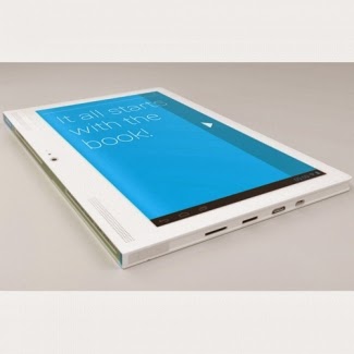
The Adam II is quite unlike other tablets you�ll see these days, most of which are rather iPad or generic-Galaxy Tab inspired. Notion Ink has clearly been inspired by the classic book design, giving the Adam II a large bezel on the left edge when you hold it up in portrait mode, indicating you�re meant to hold it this way for the majority of its operation. Strangely enough then, the speakers form part of that left bezel, as does the front facing camera, which means you�re bound to block something or the other when you�re holding the device in portrait orientation. Going with the book look has meant the Adam II is a tad boxy, and the hard edges don�t really help its cause during extended usage� one couldn�t help but feel a smaller form factor, possibly with an 8-inch screen, may have been a better choice in sheer ergonomic terms. That said, the build quality, the materials used and the clean lines far belie the price point, so if you do pick one up you�re getting premium stuff for the money.
Spinning it around
A quick glance around the device reveals a device packed to the gills with connectivity and expansion options. There�s a miniHDMI out for connecting to projectors and large screen TVs, a microSD for storage expansion and a full-sized SIM for 3G connectivity, plus 802.11 b/g/n WiFi and Bluetooth 4.0 (with Low Energy support) under the hood. There�s even USB On-the-Go support for connecting memory sticks via the USB port. It�s along the side of the device � the spine of the tablet (using the book analogy) � that you come across a rather unique feature of the Adam II: the secondary display. A rather novel addition, these are two always-on black-and-white ticker tape type displays, akin to the LCD screens you�d see on digital thermometers or scientific calculators. These are meant to push quick at-a-glance information updates to the owner, such as a custom message (like owner information), the time, currently-running apps or new email notifications. It�s a nice little touch to differentiate the Adam from the hordes of me-too Android tablets, but in use the displays are a bit of a version 1 novelty � there�s no backlight and the text is too tiny to read from a distance.
Getting a mixed-bag feel to the Adam II so far? The rest of the device is much of the same. You get a capacious 6000 mAH battery that�s stocked up on juice and a clean, largely unmodified Android 4.2.2 experience, which hopefully should mean faster Android updates in the future. There�s the display, a 10.1 inch IPS LCD screen, which runs at a paltry 1280×800 pixel resolution � a bit of a letdown given how the Nexus 7 (and other tablets) have moved up to a full-HD screen earlier last year. It�s certainly something you cannot overlook in your daily use, even if you try. With the speakers, you get a reasonable stereo effect but the overall volume is just about average. The cameras are just about basic spec for this price point, and suffer from the same issue as most budget tablets � they perform well only in good outdoor lighting.
Much of the cuts that have been made to achieve the Adam II�s pricing would have been forgiven if the 1.5 GHz dual core Cortex A9 processor and the Mali 400 quad core graphics held up to the demands of everyday use, which it does but there�s a nagging tendency for the device to slow down to a standstill if you�re multitasking between various apps on the device. However, videos and games play well on the device, which means that better performance should theoretically be just a firmware fix away, should Notion Ink decide to do anything about it.
In the end, is the �Created with love by Notion Ink Design Labs in India� enough of a reason to pick the Adam II from amongst its �Assembled in China� brethren? There�s a lot Notion Ink has done right in its second coming, but not enough to earn an unqualified recommendation.
What we liked: Build quality, great connectivity/expansion options
What we didn�t: Lags in performance, average display
Killer Feature: That capacious batteryPrice: Rs 16,499 (WiFi only), Rs 18,999 (with 3G)Enjoy Guys! and don’t forget to post your comments. � MyTricksTime.com
Mobile review: Nokia Lumia 520
The budget segment of smartphones is the most volatile and competitive in India. With so many options, an average consumer moving from a simple device to a smartphonec is often clueless.
Nokia recently launched the Lumia 520 amidst Android’s clunky and moderate performance smartphones.
Nokia Lumia 520 is the immediate successor of last year’s Lumia 510 smartphone.
Nokia Lumia 520 is a budget phone with apt hardware and a set of luxurious features. One must not forget, though, that Lumia 520 is a bumped up Lumia 510.
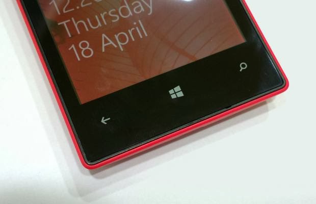
Lumia 520 appears to be totally different from the Lumia 510, which in fact looks very similar to the Lumia 620. This might be a bit odd but Lumia 520 does appear like the HTC 8S on a diet. Jokes aside, the Lumia 520 has a sharp rectangular design and slightly curved edges. Even with Lumia 520, Nokia has taken the edge-to-edge screen approach and only the edge of the back panel shows up on the sides of the screen.
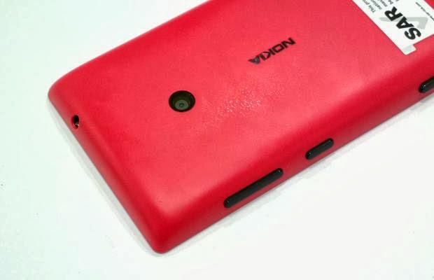
Nokia has used the same back cover method for Lumia 520 like in the Lumia 620. The back panel cover tightly hugs the chassis and makes the phone look slimmer with no protrusions or edges. Even with the Lumia 520, removing the back panel off the body is tricky. One has to put a thumb on the camera and push the back panel cover to the opposite side.
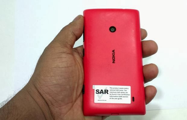
Nokia will offer this back panel in red, yellow, white, cyan and black colour options. Our red coloured review unit had a somewhat matte finish texture. All physical buttons are placed on the right side with volume control buttons on the top, along with the power/sleep/wake button and the dedicated camera button below it.
Appearing a bit out of league in terms of design, the back of Lumia 520 has curves but the edges do poke the palms if held tightly. Nevertheless, the Lumia 520 is a nice looking smartphone for the budget segment. In fact, it is one of the smart looking smartphones in this segment.
The Lumia 520 is 119.9 mm tall, 9.9 mm thick, and appears to be pleasingly slim for its form factor. Along with the removable battery, Lumia 520 weighs 124 grams and for an average person it would feel very much like the Lumia 620.
Read Also : 7 Nokia Secret Codes For You
Nokia has used a 4 inch IPS LCD display and the phone does not have a ClearBlack display technology layer. However, this 4 inch display is a 24-bit panel decent enough to be crisp as it carries 480 x 800 pixel resolution natively. Thus, it offers a decent 235 pixels per inch pixel density to make text appear crisp and neat without much tearing from a normal distance.
The screen supports multi-touch and is certainly small in comparison to larger displays. Outdoor legibility of the text is not as good as on other Nokia Lumia displays due to the lack of a ClearBlack layer.
For the budget segment, Lumia 520 packs a dual core 1 GHz Qualcomm Snapdragon S4 Plus MSM8227 mobile processor paired with Adreno 305 graphics chip and 512 MB RAM. Apparently, Nokia has used the same processor, graphics and RAM combination for Lumia 620 and Lumia 720 devices as well.
Apart from twice the RAM of the Lumia 510, Lumia 520 packs 8 GB on board storage and can support up to a 64 GB micro SD card in the memory slot. Surprisingly, Nokia has removed the stereo FM radio module, which existed in the Lumia 510. Other than that, Lumia 520 features a GPS chip with A-GPS and Glonass support for faster location lock and Bluetooth 3.0.
In terms of hardware, the Lumia 520 is quite competitively placed alongside several Android smartphones, which too feature a quad core mobile processor and large screen display.
Microsoft Windows Phone 8 is seriously smooth and fluid on the Lumia 520 despite the 512 MB RAM packed inside. The touchscreen feedback was fine and overall user experience of Windows Phone 8 was pleasant. Windows Phone 8 brings along the built-in MS Office Suite with word processor, presentation and spreadsheet apps. While most pre-loaded apps belong to Nokia, it was interesting to see the World of Redbull app preloaded on the phone. This app is a single channel gateway to wide categories of events, information and images powered by Red Bull. It has News, Map, Photos, Culture, Voice Control, Sports and other options to keep the user entertained.
The Nokia Lumia Exclusive apps include Nokia Here (previously Maps). These maps can now be used for location based activities and even offline navigation. Nokia Here Drive provides turn by turn navigation and it can also be voice guided. The City Lens app from Nokia brings Augmented Reality by showing nearby places mapped on the display while pointing a camera in the right direction. Apart from that, the social networking apps work like a breeze on this smartphone.
Nokia has packed a 5 megapixel camera at the back and provides a dedicated camera key along the side. There is no LED flash to support the camera in low luminance surroundings. The � inch camera module does not have Carl Zeiss Tessar lens treatment and carries f/2.4 aperture with a focal length of 28 mm. The touchscreen display acts as a large viewfinder and though there is autofocus, one needs to touch the display for focusing on a particular area. It goes without saying that the camera app can be used only in landscape orientation. The photo settings offer several options to manipulate such as Scenes, ISO, Exposure Value, Aspect Ratio and White Balance.
Like other Lumia devices, Nokia has added four lens softwares pre-loaded with the camera app – Bing Vision, Panorama, Cinematograph and Smart Shoot. One of them needs to be downloaded from the Windows Phone Store. These software based lenses are to be used for taking better pictures. Smart Shoot is a kind of burst mode for it shoots multiple images and the user gets to choose the best. This camera can be used to record 720p HD videos with no exceptional quality expectations. However, it is a good improvement over the VGA quality video recording offered by Lumia 510. There is no front facing camera in this smartphone, which is quite expected considering the tight budget level pricing.
This is not one of the best cameras in the budget segment. The focus goes a bit off when the physical camera key is used and the resultant image comes out a bit blurred. We tried our best to be patient but then succumbed to using the touchscreen for clicking photos. And yes, we did miss the LED flash a number of times but that’s a trade-off one has to live with.
Nokia has placed the speaker at the back as a very small outlet. It is not the loudest, but it is fair enough for enjoying songs in a room. Nokia has added the Nokia Music app, which also includes Nokia Mix Radio and therefore has access to a large library of downloadable music. There is a separate Music+Videos that stores individually uploaded music and videos. The native music player brings software equalization presets, which will help music lovers set them as per their taste. Music output is good enough for a casual music lover.
The phone can support MP4 and AVI files so your video collection can be simply transferred to the phone. The video player has a simple interface and videos can be transferred with the Windows Phone PC Sync client.
Photo Hub lets users enjoy photos and albums at ease. Create albums or let the camera roll take images to be shown under the tiles on the home screen. Lumia 520 may not be the best multimedia handset, but when it comes to performance it does the job. When it comes to gaming it misses out on loads of popular games due to a mere 512 MB RAM. All those apps that require RAM muscle will not run on the Lumia 520.
Nokia has added a 1430 mAh removable battery and it is a decent bump from the 1300 mAh battery bearing Lumia 510. The little bump in the battery certainly helps normal usage over 3G or 2G networks. However, if the phone is used for data heavy activities such as streaming videos or playing games, then the battery juice continues to drop swiftly. One can expect about 8.5 hours and more of talk time over 3G networks.
With such heavy usage, the phone cannot make it through the day and needs to be recharged. However, with normal usage involving a couple of calls, texting and social media usage, the phone just manages to touch the day’s end with some life left. One should thank Nokia for a removable battery and should hope that some battery life improving tweaks will be pushed through future software updates.
Nokia has priced the Lumia 520 with Windows Phone 8 at Rs 10,499 officially through its Nokia Priority Stores. This is a fantastic price because the handset can really perform smoothly with its limited hardware, unlike other Android devices. The best part is that the same phone can be purchased at a good discount from resellers and online retailers.
Anyone who is simply frustrated with the lack of apps and wants a no nonsense experience at a limited budget – pick up the Lumia 520 to be content. In the crowded and flooded budget segment of sub-Rs 10,000 devices the Lumia 520 may not be the best in terms of specifications or looks, but it certainly delivers the performance for its price and is consistent. One must not forget the extra goodies in the form of Nokia Lumia Exclusive apps offered with the Windows Phone 8 package. As mentioned earlier, we recommend the Lumia 520 for a basic, no nonsense experience. Of course, there will be a lack of enough apps but when you seek consistency on limited hardware, that aspiration is too far fetched.
Enjoy Guys! and don’t forget to post your comments. � MyTricksTime.com
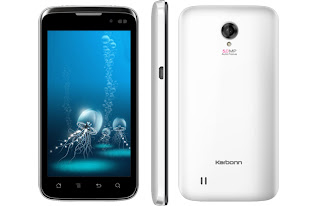
Karbonn A21 Unboxing and Hands on Review
Karbonn A21 Specifications:
| Processor | 1.2GHz Dual Core Qualcomm Snapdragon Processor |
| GPU | Adreno 203 |
| Dual SIM | 3G + 2G (both GSM) |
| OS | Android 4.0 ICS |
| Screen | 4.5inch Capacitive Touchscreen |
| Camera | Primary: 5MP; Secondary: 1.3MP |
| Weight | NA |
| Battery | 1800mAh Li-Ion (Talk-time: up to 5hours) |
| Memory | RAM: 512MB; Internal: 4GB; External up to 32GB. |
| Wi-Fi | Yes |
| 3G | Yes |
| USB | Yes |
| HDMI | No |
| GPS | Yes |
| Video Calling | Yes |
| Bluetooth | Yes |
| FM Radio | Yes |
| PRICE | Rs. 11,000 |
Read Also :
Samsung Galaxy S3 Hardware ReviewsEnjoy Guys! and don’t forget to post your comments. � MyTricksTime.com
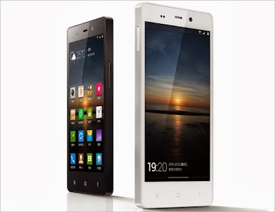
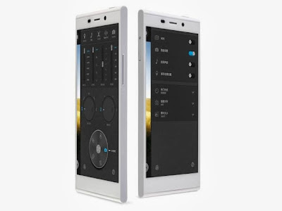
Gionee Elife E7 launched in India, price starts Rs. 26,999
Gionee has officially unveiled the Elife E7 in India starting Rs. 26,999. The Chinese handset maker has announced that the smartphone will hit the market by January 15. Gionee globally announced the Elife E7 in November this year, the successor to the Elife E6.
Gionee Elife E7 detailed specifications
| General | |
| Release date | November 2013 |
| Form factor | Touchscreen |
| Weight (g) | 150.00 |
| Battery capacity (mAh) | 2500 |
| Removable battery | No |
| SAR value | NA |
| Display | |
| Screen size (inches) | 5.50 |
| Touchscreen | Yes |
| Touchscreen type | Capacitive |
| Resolution | 1080×1920 pixels |
| Colours | 16M |
| Hardware | |
| Processor | 2.2GHz quad-core |
| Processor make | Qualcomm Snapdragon 800 |
| RAM | 2GB |
| Internal storage | 16GB |
| Camera | |
| Rear camera | 16-megapixel |
| Flash | Yes |
| Front camera | 8-megapixel |
| Software | |
| Operating System | Android 4.2 |
| Java support | Yes |
| Browser supports Flash | Yes |
| Connectivity | |
| Wi-Fi | Yes |
| Wi-Fi standards supported | 802.11 b/ g/ n |
| GPS | Yes |
| Bluetooth | Yes |
| NFC | Yes |
| Infrared | No |
| DLNA | No |
| Wi-Fi Direct | No |
| MHL Out | No |
| HDMI | No |
| Headphones | 3.5mm |
| FM | Yes |
| USB | Micro-USB |
| Charging via Micro-USB | Yes |
| Proprietary charging connector | No |
| Proprietary data connector | No |
| Number of SIMs | 1 |
| SIM Type | Micro-SIM |
| GSM/ CDMA | GSM |
| 2G frequencies supported | GSM 900/ 1800 |
| 3G | Yes |
| 3G frequencies supported | 2100 |
| Sensors | |
| Compass/ Magnetometer | No |
| Proximity sensor | Yes |
| Accelerometer | Yes |
| Ambient light sensor | Yes |
| Gyroscope | No |
| Barometer | No |
| Temperature sensor | No |
Enjoy Guys! and don’t forget to post your comments. � MyTricksTime.com


