Customized and Stylized Subscription Widget

Many of this blog readers asked me which plugin/code I�m using in sidebar for Stylized Subscription Widget. So today I decide to share this with you! because It�s almost more than 2 months. I�ve not shared any Stylized Subscription for Widget Blogger and WordPress Widget.
Coming back to topic this widget simple uses HTML and CSS. 
It�ll keep your sidebar clean! ;) It contains FeedBurner Form, Twitter Follow Button, Facebook and Google buttons.

Adding Customized And Stylized Subscription Widget

You just need to place a code to your blog widget Follow following steps to add Customized and Stylized Subscription Widget to WordPress and Blogger both!
Adding Subscription Widget To Blogger
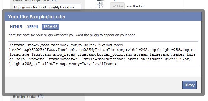
  1. Go to Dashboard > Design > Page Elements.
  2. Click Add A Gadget. In window, select HTML/Javascript .
  3. Copy the code below and paste it inside the box.
  4. Save the gadget. Drag the gadget and reposition it under Blog Posts gadget.
  5. Click Save button.
Adding Subscription Widget To WordPress
  1. Go to Dashboard > Appearance > Widgets > Available Widgets.
  2. Drag Text widget into a sidebar.
  3. Paste in the code.
  4. Save.

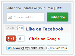
Code for Stylized Subscription Widget

<style>

#ABT-mashable-bar {
background-color: #f9f9f9; box-shadow: 0 0 3px #b0b0b0;
border:1px solid #ccc;
padding:6px;
width: 270px;

}

#subscribe-box .fb-like-box { border: 1px solid #EBEBEB; padding: 5px; background:#f7f7f7;}
#subscribe-box .gplusone { background: #f7fcfc; border: 1px solid #EBEBEB; border-top: 1px solid #fff; color: #000; font-size: 10px; line-height: 1px; padding: 9px 11px;}
#subscribe-box .twitter-follow { background: #eef9f9; border: 1px solid #dff6f6; border-top: 1px solid #fff; padding:5px 11px;}

#subscribe-box .email-box {
border-right: 1px solid #C7DBE2;
border-left: 1px solid #C7DBE2; background: #d3e0ed;

border: 1px solid #ccdaed; padding:11px; margin-bottom: -4px;}

#subscribe-box .email-box h4{color: #555;font-family: Arial;font-size: 12px; margin: 0 0 10px;}

#subscribe-box .email-box .txt,#subscribe-box .email-box .txt:focus{

border: 1px solid #d2d2d2;

color: #a19999; font-size: 12px;

border-radius: 5px;
-moz-border-radius: 5px;
-webkit-border-radius: 5px;

height:21px;

padding: 6px 28px 8px; width: 93px;

}

#subscribe-box .email-box .btn,#subscribe-box .email-box .btn:focus{ float:right;

margin-top: 0px;

background: #30a146; background: linear-gradient(top, #30a146 0%, #249334 100%); background: -moz-linear-gradient(top, #30a146 0%, #249334 100%); background: -webkit-gradient(linear, left top, left bottom, color-stop(0%, #30a146), color-stop(100%, #249334)); background: -webkit-linear-gradient(top, #30a146 0%, #249334 100%); text-shadow: 1px 1px 0 rgba(0, 0, 0, .4); font-weight:bold; font-family: "Droid Sans","Lucida Grande",Tahoma,sans-serif;

font-family: "Arial","Helvetica",sans-serif;
border-radius:3px;
-moz-border-radius:3px;
-webkit-border-radius:3px;
border:1px solid #248334 ;
color:white;
text-shadow:#d08d00 1px 1px 0;
padding:8.5px 10px;
margin-left:3px;
font-weight:bold;
font-size:12.2px;
cursor:pointer;
border-image: initial;}

#subscribe-box .email-box .btn:hover{

opacity: .8;
border-radius:3px;
-moz-border-radius:3px;
-webkit-border-radius:3px;
border:1px solid #248334 ;
color:#FFFFFF;
text-shadow:#d08d00 1px 1px 0}

</style>

<div id="ABT-mashable-bar">
<div id="subscribe-box">
<div class="email-box">
<h4>Subscribe updates on your <a href="http://feedburner.google.com/fb/a/mailverify?uri=
MyTricksTime" target="_blank">Email</a> | <a href="http://feeds.feedburner.com/MyTricksTime" target="_blank">RSS</a></h4>
<form action="http://feedburner.google.com/fb/a/mailverify" method="post" onsubmit="window.open('http://feedburner.google.com/fb/a/mailverify?uri=
MyTricksTime', 'popupwindow', 'scrollbars=yes,width=700px,height=700px');return true" target="popupwindow">
<input class="txt" style="background: #FFF url('http://i.imgur.com/2BCD0.png') no-repeat 6px !important;" onfocus="if (this.value == 'Your email ID ') {this.value = '';}" onblur="if (this.value == '') {this.value = 'Your email ID ';}" type="text" name="email" value="Your email ID " />

<input type="hidden" name="uri" value="
MyTricksTime" />

<input type="hidden" name="loc" value="en_US" />

<input class="btn" style="margin-left: 4px;" type="submit" value="Subscribe" />
<div style="clear: both;"></div>
</form></div>

<div class="fb-like-box"><iframe style="border: none; overflow: hidden; width: 80px; height: 21px;" src="//www.facebook.com/plugins/like.php?href=http%3A%2F%2Fwww.facebook.com%2
MyTricksTime&send=false&layout=button_count&width=80&show_faces=false&action=like&colorscheme=light&font&height=21" frameborder="0" scrolling="no" width="320" height="240"></iframe><a style="color: #3b5998; font-family: ubuntu; font-size: 18px; font-weight: bold; line-height: 20px;" href="http://www.facebook.com/MyTricksTime" rel="nofollow" target="_blank"> Like on Facebook </a>
<div class="clear"></div>
</div>

<div class="gplusone">
<div style="float: left; width: 90px;">
<div id="___plusone_0" style="height: 24px; width: 106px; display: inline-block; text-indent: 0pt; margin: 0pt; padding: 0pt; background: none repeat scroll 0% 0% transparent; border-style: none; float: none; line-height: normal; font-size: 1px; vertical-align: baseline;"><iframe id="I1_1322986463651" style="position: static; left: 0pt; top: 0pt; width: 106px; margin: 0px; border-style: none; height: 24px; visibility: visible;" title="+1" name="I1_1322986463651" src="https://plusone.google.com/_/+1/fastbutton?url=http%3A%2F%2Fwww.MyTricksTime.com%2F&size=standard&count=true&annotation=&hl=en-US&jsh=m%3B%2F_%2Fapps-static%2F_%2Fjs%2Fwidget%2F__features__%2Frt%3Dj%2Fver%3D-8uDua_W7bo.en_GB.%2Fsv%3D1%2Fam%3D%218NuGo4ypxRCIwtBaLA%2Fd%3D1%2F#id=I1_1322986463651&parent=http%3A%2F%2Fwww.
MyTricksTime.com&rpctoken=511986996&_methods=onPlusOne%2C_ready%2C_close%2C_open%2C_resizeMe" frameborder="0" marginwidth="0" marginheight="0" scrolling="no" width="100%" height="240"></iframe></div>
</div>
<a style="color: #dd0000; font-family: ubuntu; font-size: 16px; font-weight: bold; line-height: 24px;" href="https://plus.google.com/
102588571388484646448" rel="author" target="_blank">Circle on Google+</a>
<div class="clear"></div>
<!-- Place this render call where appropriate -->

<script type="text/javascript">// <![CDATA[
(function() {

var po = document.createElement('script'); po.type = 'text/javascript'; po.async = true;

po.src = 'https://apis.google.com/js/plusone.js';

var s = document.getElementsByTagName('script')[0]; s.parentNode.insertBefore(po, s);

})();
// ]]></script></div>
<div class="twitter-follow">
<iframe style="width: 300px; height: 20px;" title="" src="http://platform.twitter.com/widgets/follow_button.html#_=1322986464549&button=blue&id=twitter-widget-22&lang=en&screen_name=
MyTricksTime" frameborder="0" scrolling="no" width="320" height="240"></iframe>

<script type="text/javascript" src="//platform.twitter.com/widgets.js"></script></div>
<div id="mashable" style="height: 12px; background: #f9f9f9; border: 0px solid #CCC; border-top: 1px solid white; text-align: right; border-image: initial; font-size: 10px;"><span class="author-credit" style="font-family: Arial, Helvetica, sans-serif;"><a href="http://www.MyTricksTime.com" target="_blank">Widget �</a></span></div>
</div>
</div>
If you face any problem with code. Please Let Us Know Contact US

Customization!

Due to some issue. I can�t highlight changes you�ve to make in above code. Hope you won�t mind ;) . Now look for bold letter above and replace it with your Username, IDs like;
  • Replace MyTricksTime with your feedburner Feed URL.
  • Replace MyTricksTime with your facebook Page URL.
  • Replace MyTricksTime with your twitter url.
  • Replace www.MyTricksTime.com with your blog URL.
  • And at least replace https://plus.google.com/102588571388484646448 with your Google+ Profile Link.

Credits!

This widget is first shared on MyTricksTime. Readers are requested to link back if you�re going to share this widget on their blog!
That�s all. I hope you�ll like this widget. Let me know if I missed anything or you face any issue!
Happy Blogging :D
Enjoy Guys! and don’t forget to post your comments. � MyTricksTime.com

5 Cool Numbered Page Navigation Widgets For Blogger

Page Navigation Widgets For Blogger

It�s been a long time, I�ve posted here. I was very very busy (since I�m a student, I have weekend tests, home-works etc..!), hope you understand! Well, in this post I�m gonna show you 7 different Numbered Page Navigations Widget. I�ve posted some Numbered Page Navigations before, please check them too.

Step 1 –

Go to Awesome Numbered Page Navigaiton Widget and follow all the steps except adding the CSS code. After adding the JavaScript and HTML codes then add any of the below CSS and click Save Template

Style 1

Page Navigation Widgets For Blogger

Add the below code above </b:skin>

.pagenavi span, .pagenavi a {
display
: inline-block;
padding
: 0px 9px;
margin
-right: 4px;
border
-radius: 3px;
border
: solid 1px #c0c0c0;
background
: #e9e9e9;
box
-shadow: inset 0px 1px 0px rgba(255,255,255, .8), 0px 1px 3px rgba(0,0,0, .1);
font
-size: .875em;
font
-weight: bold;
text
-decoration: none;
color
: #717171;
text
-shadow: 0px 1px 0px rgba(255,255,255, 1);
}
.pagenavi span:hover,.pagenavi a:hover {
background
: #fefefe;
background
: -webkit-gradient(linear, 0% 0%, 0% 100%, from(#FEFEFE), to(#f0f0f0));
background
: -moz-linear-gradient(0% 0% 270deg,#FEFEFE, #f0f0f0);
}
.pagenavi a.current {
border
: none;
background
: #616161;
box
-shadow: inset 0px 0px 8px rgba(0,0,0, .5), 0px 1px 0px rgba(255,255,255, .8);
color
: #f0f0f0;
text
-shadow: 0px 0px 3px rgba(0,0,0, .5);
}


Style 2

Numbered Page Navigation Widgets For Blogger

Add the below code above </b:skin>
.pagenavi span, .pagenavi a {
display
: inline-block;
padding
: 0px 9px;
margin
-right: 4px;
border
-radius: 3px;
border
: solid 1px #32373b;
background
: #3e4347;
box
-shadow: inset 0px 1px 1px rgba(255,255,255, .1), 0px 1px 3px rgba(0,0,0, .1);
font
-size: .875em;
font
-weight: bold;
text
-decoration: none;
color
: #feffff;
text
-shadow: 0px 1px 0px rgba(0,0,0, .5);
}
.pagenavi span:hover,.pagenavi a:hover {
background
: #3d4f5d;
background
: -webkit-gradient(linear, 0% 0%, 0% 100%, from(#547085), to(#3d4f5d));
background
: -moz-linear-gradient(0% 0% 270deg,#547085, #3d4f5d);
}
.pagenavi a.current {
border
: none;
background
: #616161;
box
-shadow: inset 0px 0px 8px rgba(0,0,0, .5), 0px 1px 0px rgba(255,255,255, .8);
color
: #f0f0f0;
text
-shadow: 0px 0px 3px rgba(0,0,0, .5);
}

Style 3

Numbered Page Navigation Widgets For Blogger

Add the below code above </b:skin>
.pagenavi {
width
:300px;
margin
: 50px auto;
}
.pagenavi span, .pagenavi a {
background
: #f7f7f7;
background
: -webkit-linear-gradient(top, #f7f7f7 0%,#f5f5f5 52%,#ebebeb 100%);
background
: -moz-linear-gradient(top, #f7f7f7 0%,#f5f5f5 52%,#ebebeb 100%);
background
: -o-linear-gradient(top, #f7f7f7 0%,#f5f5f5 52%,#ebebeb 100%);
background
: -ms-linear-gradient(top, #f7f7f7 0%,#f5f5f5 52%,#ebebeb 100%);
background
: linear-gradient(top, #f7f7f7 0%,#f5f5f5 52%,#ebebeb 100%);
padding
: 5px 10px;
text
-decoration: none;
color
: #7e7e7e;
border
: 1px solid #c6c6c6;
-webkit-box-shadow: inset 0 4px 3px rgba(255,255,255,0.6), 0 1px 3px rgba(0,0,0,.2);
-moz-box-shadow: inset 0 4px 3px rgba(255,255,255,0.6), 0 1px 3px rgba(0,0,0,.2);
box
-shadow: inset 0 4px 3px rgba(255,255,255,0.6), 0 1px 3px rgba(0,0,0,.2);
font
-weight: bold;
border
-radius:3px;
}
.pagenavi span:hover,.pagenavi a:hover, .pagenavi a.current {
background
: #9ad6fb;
background
: -webkit-linear-gradient(top, #9ad6fb 0%,#77c4fc 100%);
background
: -moz-linear-gradient(top, #9ad6fb 0%,#77c4fc 100%);
background
: -o-linear-gradient(top, #9ad6fb 0%,#77c4fc 100%);
background
: -ms-linear-gradient(top, #9ad6fb 0%,#77c4fc 100%);
background
: linear-gradient(top, #9ad6fb 0%,#77c4fc 100%);
border
: 1px solid #72ade4;
color
: #4879a6;
-webkit-box-shadow: inset 0 1px 4px rgba(255,255,255,0.75), 0 1px 3px rgba(79,126,167,.5);
-moz-box-shadow: inset 0 1px 4px rgba(255,255,255,0.75), 0 1px 3px rgba(79,126,167,.5);
box
-shadow: inset 0 1px 4px rgba(255,255,255,0.75), 0 1px 3px rgba(79,126,167,.5);
-webkit-transition: all 0.25s ease 0s;
-moz-transition: all 0.25s ease 0s;
-o-transition: all 0.25s ease 0s;
transition
: all 0.25s ease 0s;
}
.pagenavi { border:none; }

Style 4

numbered Page Navigation Widgets For Blogger

Add the below code above </b:skin>
.pagenavi {
width
:300px;
margin
: 50px auto;
}
.pagenavi span, .pagenavi a {
display
: block;
text
-decoration: none;
color
: #717171;
font
: bold 11px Arial, sans-serif;
text
-shadow: 0px 1px white;
padding
: 5px 8px;
-webkit-border-radius: 3px;
-moz-border-radius: 3px;
border
-radius: 3px;
-webkit-box-shadow: 0px 1px 3px 0px rgba(0,0,0,0.35);
-moz-box-shadow: 0px 1px 3px 0px rgba(0,0,0,0.35);
box
-shadow: 0px 1px 3px 0px rgba(0,0,0,0.35);
background
: #f9f9f9;
background
: -webkit-linear-gradient(top, #f9f9f9 0%, #e8e8e8 100%);
background
: -moz-linear-gradient(top, #f9f9f9 0%, #e8e8e8 100%);
background
: -o-linear-gradient(top, #f9f9f9 0%, #e8e8e8 100%);
background
: -ms-linear-gradient(top, #f9f9f9 0%, #e8e8e8 100%);
background
: linear-gradient(top, #f9f9f9 0%, #e8e8e8 100%);
filter
: progid:DXImageTransform.Microsoft.gradient( startColorstr='#f9f9f9', endColorstr='#e8e8e8',GradientType=0 );
}
.pagenavi span:hover,.pagenavi a:hover {
-webkit-box-shadow: 0px 1px 3px 0px rgba(0,0,0,0.55);
-moz-box-shadow: 0px 1px 3px 0px rgba(0,0,0,0.55);
box
-shadow: 0px 1px 3px 0px rgba(0,0,0,0.55);
background
: #fff;
background
: -webkit-linear-gradient(top, #fff 0%, #e8e8e8 100%);
background
: -moz-linear-gradient(top, #fff 0%, #e8e8e8 100%);
background
: -o-linear-gradient(top, #fff 0%, #e8e8e8 100%);
background
: -ms-linear-gradient(top, #fff 0%, #e8e8e8 100%);
background
: linear-gradient(top, #fff 0%, #e8e8e8 100%);
filter
: progid:DXImageTransform.Microsoft.gradient( startColorstr='#fff', endColorstr='#e8e8e8',GradientType=0 );
border
:none;
color
:#575757;
}
.pagenavi a.current {
color
: white;
text
-shadow: 0px 1px #3f789f;
-webkit-box-shadow: 0px 1px 2px 0px rgba(0,0,0,0.8);
-moz-box-shadow: 0px 1px 2px 0px rgba(0,0,0,0.8);
box
-shadow: 0px 1px 2px 0px rgba(0,0,0,0.8);
background
: #7cb9e5;
background
: -webkit-linear-gradient(top, #7cb9e5 0%, #57a1d8 100%);
background
: -moz-linear-gradient(top, #7cb9e5 0%, #57a1d8 100%);
background
: -o-linear-gradient(top, #7cb9e5 0%, #57a1d8 100%);
background
: -ms-linear-gradient(top, #7cb9e5 0%, #57a1d8 100%);
background
: linear-gradient(top, #7cb9e5 0%, #57a1d8 100%);
filter
: progid:DXImageTransform.Microsoft.gradient( startColorstr='#7cb9e5', endColorstr='#57a1d8',GradientType=0 );
}
.pagenavi a.current:hover {
-webkit-box-shadow: 0px 1px 2px 0px rgba(0,0,0,0.9);
-moz-box-shadow: 0px 1px 2px 0px rgba(0,0,0,0.9);
box
-shadow: 0px 1px 2px 0px rgba(0,0,0,0.9);
background
: #99cefc;
background
: -webkit-linear-gradient(top, #99cefc 0%, #57a1d8 100%);
background
: -moz-linear-gradient(top, #99cefc 0%, #57a1d8 100%);
background
: -o-linear-gradient(top, #99cefc 0%, #57a1d8 100%);
background
: -ms-linear-gradient(top, #99cefc 0%, #57a1d8 100%);
background
: linear-gradient(top, #99cefc 0%, #57a1d8 100%);
filter
: progid:DXImageTransform.Microsoft.gradient( startColorstr='#99cefc', endColorstr='#57a1d8',GradientType=0 );

}
.pagenavi a.current:active {
-webkit-box-shadow: inset 0px 1px 3px 0px rgba(0,0,0,0.5), 0px 1px 1px 0px rgba(255,255,255,1) !important;
-moz-box-shadow: inset 0px 1px 3px 0px rgba(0,0,0,0.5), 0px 1px 1px 0px rgba(255,255,255,1) !important;
box
-shadow: inset 0px 1px 3px 0px rgba(0,0,0,0.5), 0px 1px 1px 0px rgba(255,255,255,1) !important;
}

Style 5

Add the below code above </b:skin>
.pagenavi span, .pagenavi a {
display
: block;
text
-decoration: none;
color
: #717171;
font
: bold 11px Arial, sans-serif;
text
-shadow: 0px 1px white;
padding
: 5px 8px;
-webkit-border-radius: 3px;
-moz-border-radius: 3px;
border
-radius: 3px;
-webkit-box-shadow: 0px 1px 3px 0px rgba(0,0,0,0.35);
-moz-box-shadow: 0px 1px 3px 0px rgba(0,0,0,0.35);
box
-shadow: 0px 1px 3px 0px rgba(0,0,0,0.35);
background
: #f9f9f9;
background
: -webkit-linear-gradient(top, #f9f9f9 0%, #e8e8e8 100%);
background
: -moz-linear-gradient(top, #f9f9f9 0%, #e8e8e8 100%);
background
: -o-linear-gradient(top, #f9f9f9 0%, #e8e8e8 100%);
background
: -ms-linear-gradient(top, #f9f9f9 0%, #e8e8e8 100%);
background
: linear-gradient(top, #f9f9f9 0%, #e8e8e8 100%);
filter
: progid:DXImageTransform.Microsoft.gradient( startColorstr='#f9f9f9', endColorstr='#e8e8e8',GradientType=0 );
}
.pagenavi span:hover,.pagenavi a:hover {
-webkit-box-shadow: 0px 1px 3px 0px rgba(0,0,0,0.55);
-moz-box-shadow: 0px 1px 3px 0px rgba(0,0,0,0.55);
box
-shadow: 0px 1px 3px 0px rgba(0,0,0,0.55);
background
: #fff;
background
: -webkit-linear-gradient(top, #fff 0%, #e8e8e8 100%);
background
: -moz-linear-gradient(top, #fff 0%, #e8e8e8 100%);
background
: -o-linear-gradient(top, #fff 0%, #e8e8e8 100%);
background
: -ms-linear-gradient(top, #fff 0%, #e8e8e8 100%);
background
: linear-gradient(top, #fff 0%, #e8e8e8 100%);
filter
: progid:DXImageTransform.Microsoft.gradient( startColorstr='#fff', endColorstr='#e8e8e8',GradientType=0 );
}
.pagenavi span:active,.pagenavi a:active, .pagenavi a.current:hover {
-webkit-box-shadow: inset 0px 1px 3px 0px rgba(0,0,0,0.5), 0px 1px 1px 0px rgba(255,255,255,1) !important;
-moz-box-shadow: inset 0px 1px 3px 0px rgba(0,0,0,0.5), 0px 1px 1px 0px rgba(255,255,255,1) !important;
box
-shadow: inset 0px 1px 3px 0px rgba(0,0,0,0.5), 0px 1px 1px 0px rgba(255,255,255,1) !important;
}
.pagenavi a.current {
color
: white;
text
-shadow: 0px 1px #3f789f;
-webkit-box-shadow: 0px 1px 2px 0px rgba(0,0,0,0.8);
-moz-box-shadow: 0px 1px 2px 0px rgba(0,0,0,0.8);
box
-shadow: 0px 1px 2px 0px rgba(0,0,0,0.8);
background
: #7cb9e5;
background
: -webkit-linear-gradient(top, #7cb9e5 0%, #57a1d8 100%);
background
: -moz-linear-gradient(top, #7cb9e5 0%, #57a1d8 100%);
background
: -o-linear-gradient(top, #7cb9e5 0%, #57a1d8 100%);
background
: -ms-linear-gradient(top, #7cb9e5 0%, #57a1d8 100%);
background
: linear-gradient(top, #7cb9e5 0%, #57a1d8 100%);
filter
: progid:DXImageTransform.Microsoft.gradient( startColorstr='#7cb9e5', endColorstr='#57a1d8',GradientType=0 );
}
.pagenavi a.current:hover {
-webkit-box-shadow: 0px 1px 2px 0px rgba(0,0,0,0.9);
-moz-box-shadow: 0px 1px 2px 0px rgba(0,0,0,0.9);
box
-shadow: 0px 1px 2px 0px rgba(0,0,0,0.9);
background
: #99cefc;
background
: -webkit-linear-gradient(top, #99cefc 0%, #57a1d8 100%);
background
: -moz-linear-gradient(top, #99cefc 0%, #57a1d8 100%);
background
: -o-linear-gradient(top, #99cefc 0%, #57a1d8 100%);
background
: -ms-linear-gradient(top, #99cefc 0%, #57a1d8 100%);
background
: linear-gradient(top, #99cefc 0%, #57a1d8 100%);
filter
: progid:DXImageTransform.Microsoft.gradient( startColorstr='#99cefc', endColorstr='#57a1d8',GradientType=0 );
}
Enjoy Guys! and don’t forget to post your comments. � MyTricksTime.com

Pure CSS3 Expanding Vertical Navigation Menu For Blogger

This time around we�re going to build a super useful expanding vertical navigation menu. It�s a great way to hide a lot of links in a fairly small space and the animations will add a nice touch to your site. Even if you�re a complete beginner, you should be able to pull this off.

DEMO


As you can see ( in demo ), the sections on the bottom are closed by default and slide open when you over over them. However, to add some nice variation we�ll also include a section that stays open all of the time. In the main section that is always open we�ll include a brief welcome message and in the sections that slide open will be sub-sections of navigation links.

Read also : 
Red Down Full Mobile Movie

Now that we have a good idea of where we�re going, Let�s get started!

The HTML

The first thing we�re going to do is toss in some nice HTML5 codes to wrap the menu in.

<nav>
    <div class=”menu-item alpha”>
      <h4><a href=”http://www.abushaleh.net/”>Home</a></h4>
      <p>Lorem ipsum dolor sit…</p>
    </div>
    <div class=”menu-item”>
      <h4><a href=”#”>Portfolio</a></h4>
      <ul>
        <li><a href=”#”>Web</a></li>
        <li><a href=”#”>Print</a></li>
        <li><a href=”#”>Other</a></li>
      </ul>
    </div>
    <div class=”menu-item”>
      <h4><a href=”#”>About</a></h4>
      <ul>
        <li><a href=”#”>History</a></li>
        <li><a href=”#”>Meet The Owners</a></li>
        <li><a href=”#”>Awards</a></li>
      </ul>
    </div>
    <div class=”menu-item”>
      <h4><a href=”#”>Contact</a></h4>
      <ul>
        <li><a href=”#”>Phone</a></li>
        <li><a href=”#”>Email</a></li>
        <li><a href=”#”>Location</a></li>
      </ul>
    </div>
</nav>


Though it�s not styled at all, the live preview perfectly showcases the hierarchy of our navigation menu.

The CSS

We�re already finished with the HTML. Now time to start with css styles.

* {
  margin: 0px;
  padding: 0px;
}
nav {
  font-family: Helvetica, Arial, sans-serif;
  line-height: 1.5;
  margin: 50px auto; /*for display only*/
  width: 200px;
  -webkit-box-shadow: 2px 2px 5px rgba(0,0,0,0.2);
     -moz-box-shadow: 2px 2px 5px rgba(0,0,0,0.2);
          box-shadow: 2px 2px 5px rgba(0,0,0,0.2);
}
.menu-item {
  background: #fff;
  width: 200px;
}
/*Menu Header Styles 1*/
.menu-item h4 {
  color: #fff;
  font-size: 15px;
  font-weight: 500;
  padding: 7px 12px;
  background: #a90329;
}
.menu-item h4 a {
  color: white;
  display: block;
  text-decoration: none;
  width: 200px;
}
/*Menu Header Styles 2*/
.menu-item h4 {
  border-bottom: 1px solid rgba(0,0,0,0.3);
  border-top: 1px solid rgba(255,255,255,0.2);
  color: #fff;
  font-size: 15px;
  font-weight: 500;
  padding: 7px 12px;
  background: #a90329; /* Old browsers */
  background: -moz-linear-gradient(top, #a90329 0%, #8f0222 44%, #6d0019 100%); /* FF3.6+ */
  background: -webkit-gradient(linear, left top, left bottom, color-stop(0%,#a90329), color-stop(44%,#8f0222), color-stop(100%,#6d0019)); /* Chrome,Safari4+ */
  background: -webkit-linear-gradient(top, #a90329 0%,#8f0222 44%,#6d0019 100%); /* Chrome10+,Safari5.1+ */
  background: -o-linear-gradient(top, #a90329 0%,#8f0222 44%,#6d0019 100%); /* Opera 11.10+ */
  background: -ms-linear-gradient(top, #a90329 0%,#8f0222 44%,#6d0019 100%); /* IE10+ */
  background: linear-gradient(top, #a90329 0%,#8f0222 44%,#6d0019 100%); /* W3C */
  filter: progid:DXImageTransform.Microsoft.gradient( startColorstr=’#a90329′, endColorstr=’#6d0019′,GradientType=0 ); /* IE6-9 */
}
.menu-item h4:hover {
  background: #cc002c; /* Old browsers */
  background: -moz-linear-gradient(top,  #cc002c 0%, #6d0019 100%); /* FF3.6+ */
  background: -webkit-gradient(linear, left top, left bottom, color-stop(0%,#cc002c), color-stop(100%,#6d0019)); /* Chrome,Safari4+ */
  background: -webkit-linear-gradient(top,  #cc002c 0%,#6d0019 100%); /* Chrome10+,Safari5.1+ */
  background: -o-linear-gradient(top,  #cc002c 0%,#6d0019 100%); /* Opera 11.10+ */
  background: -ms-linear-gradient(top,  #cc002c 0%,#6d0019 100%); /* IE10+ */
  background: linear-gradient(top,  #cc002c 0%,#6d0019 100%); /* W3C */
  filter: progid:DXImageTransform.Microsoft.gradient( startColorstr=’#cc002c’, endColorstr=’#6d0019′,GradientType=0 ); /* IE6-9 */
}
.alpha p {
  font-size: 13px;
  padding: 8px 12px;
  color: #aaa;
}
/*ul Styles*/
.menu-item ul {
  background: #fff;
  font-size: 13px;
  line-height: 30px;
  list-style-type: none;
  overflow: hidden;
  padding: 0px;
}
.menu-item ul a {
  margin-left: 20px;
  text-decoration: none;
  color: #aaa;
  display: block;
  width: 200px;
}
/*li Styles*/
.menu-item li {
  border-bottom: 1px solid #eee;
}
.menu-item li:hover {
  background: #eee;
}
/*ul Styles*/
.menu-item ul {
  background: #fff;
  font-size: 13px;
  line-height: 30px;
  height: 0px; /*Collapses the menu*/
  list-style-type: none;
  overflow: hidden;
  padding: 0px;
}
/*ul Styles*/
.menu-item ul {
  background: #fff;
  font-size: 13px;
  line-height: 30px;
  height: 0px;
  list-style-type: none;
  overflow: hidden;
  padding: 0px;
  /*Animation*/
  -webkit-transition: height 1s ease;
     -moz-transition: height 1s ease;
       -o-transition: height 1s ease;
      -ms-transition: height 1s ease;
          transition: height 1s ease;
}
.menu-item:hover ul {
  height: 115px;
}


The menu is Done!

Customizations

One important thing to note here is that we can�t just set the height to auto ( in css section bolded italic red ) because for some reason this disables the animation. If you don�t want the animation, a height of auto is much more flexible and allows you to vary the number of sub-menu items. If you want to do this with the animation, you�ll have to target the height for each individually.

To add more Menu Item Section, just customize and add below codes:

    <div class=”menu-item”>
      <h4><a href=”link-here“>menu-title</a></h4>
      <ul>
        <li><a href=”link-here“>sub-menu-title</a></li>
        <li><a href=”link-here“>sub-menu-title</a></li>
        <li><a href=”link-here“>sub-menu-title</a></li>
      </ul>
    </div>


One Step Installation For Blogger/Blogspot Blogs

This step for Beginner Bloggers and Blogger/blogspot users. Not every one have compatibility with coding.

To add this Menu to your blogger blog follow below steps:

1. Go to Blogger Dashboard > Layout
2. Add a HTML/Javascript widget and paste the below codes:

<style type=”text/css”>
* {
  margin: 0px;
  padding: 0px;
}
nav {
  font-family: Helvetica, Arial, sans-serif;
  line-height: 1.5;
  margin: 50px auto; /*for display only*/
  width: 200px;
  -webkit-box-shadow: 2px 2px 5px rgba(0,0,0,0.2);
     -moz-box-shadow: 2px 2px 5px rgba(0,0,0,0.2);
          box-shadow: 2px 2px 5px rgba(0,0,0,0.2);
}
.menu-item {
  background: #fff;
  width: 200px;
}
/*Menu Header Styles 1*/
.menu-item h4 {
  color: #fff;
  font-size: 15px;
  font-weight: 500;
  padding: 7px 12px;
  background: #a90329;
}
.menu-item h4 a {
  color: white;
  display: block;
  text-decoration: none;
  width: 200px;
}
/*Menu Header Styles 2*/
.menu-item h4 {
  border-bottom: 1px solid rgba(0,0,0,0.3);
  border-top: 1px solid rgba(255,255,255,0.2);
  color: #fff;
  font-size: 15px;
  font-weight: 500;
  padding: 7px 12px;
  background: #a90329; /* Old browsers */
  background: -moz-linear-gradient(top, #a90329 0%, #8f0222 44%, #6d0019 100%); /* FF3.6+ */
  background: -webkit-gradient(linear, left top, left bottom, color-stop(0%,#a90329), color-stop(44%,#8f0222), color-stop(100%,#6d0019)); /* Chrome,Safari4+ */
  background: -webkit-linear-gradient(top, #a90329 0%,#8f0222 44%,#6d0019 100%); /* Chrome10+,Safari5.1+ */
  background: -o-linear-gradient(top, #a90329 0%,#8f0222 44%,#6d0019 100%); /* Opera 11.10+ */
  background: -ms-linear-gradient(top, #a90329 0%,#8f0222 44%,#6d0019 100%); /* IE10+ */
  background: linear-gradient(top, #a90329 0%,#8f0222 44%,#6d0019 100%); /* W3C */
  filter: progid:DXImageTransform.Microsoft.gradient( startColorstr=’#a90329′, endColorstr=’#6d0019′,GradientType=0 ); /* IE6-9 */
}
.menu-item h4:hover {
  background: #cc002c; /* Old browsers */
  background: -moz-linear-gradient(top,  #cc002c 0%, #6d0019 100%); /* FF3.6+ */
  background: -webkit-gradient(linear, left top, left bottom, color-stop(0%,#cc002c), color-stop(100%,#6d0019)); /* Chrome,Safari4+ */
  background: -webkit-linear-gradient(top,  #cc002c 0%,#6d0019 100%); /* Chrome10+,Safari5.1+ */
  background: -o-linear-gradient(top,  #cc002c 0%,#6d0019 100%); /* Opera 11.10+ */
  background: -ms-linear-gradient(top,  #cc002c 0%,#6d0019 100%); /* IE10+ */
  background: linear-gradient(top,  #cc002c 0%,#6d0019 100%); /* W3C */
  filter: progid:DXImageTransform.Microsoft.gradient( startColorstr=’#cc002c’, endColorstr=’#6d0019′,GradientType=0 ); /* IE6-9 */
}
.alpha p {
  font-size: 13px;
  padding: 8px 12px;
  color: #aaa;
}
/*ul Styles*/
.menu-item ul {
  background: #fff;
  font-size: 13px;
  line-height: 30px;
  list-style-type: none;
  overflow: hidden;
  padding: 0px;
}
.menu-item ul a {
  margin-left: 20px;
  text-decoration: none;
  color: #aaa;
  display: block;
  width: 200px;
}
/*li Styles*/
.menu-item li {
  border-bottom: 1px solid #eee;
}
.menu-item li:hover {
  background: #eee;
}
/*ul Styles*/
.menu-item ul {
  background: #fff;
  font-size: 13px;
  line-height: 30px;
  height: 0px; /*Collapses the menu*/
  list-style-type: none;
  overflow: hidden;
  padding: 0px;
}
/*ul Styles*/
.menu-item ul {
  background: #fff;
  font-size: 13px;
  line-height: 30px;
  height: 0px;
  list-style-type: none;
  overflow: hidden;
  padding: 0px;
  /*Animation*/
  -webkit-transition: height 1s ease;
     -moz-transition: height 1s ease;
       -o-transition: height 1s ease;
      -ms-transition: height 1s ease;
          transition: height 1s ease;
}
.menu-item:hover ul {
  height: 115px;
}
</style>
<nav>
    <div class=”menu-item alpha”>
      <h4><a href=”http://www.abushaleh.net/”>Home</a></h4>
      <p>Lorem ipsum dolor sit…</p>
    </div>
    <div class=”menu-item”>
      <h4><a href=”#”>Portfolio</a></h4>
      <ul>
        <li><a href=”#”>Web</a></li>
        <li><a href=”#”>Print</a></li>
        <li><a href=”#”>Other</a></li>
      </ul>
    </div>
    <div class=”menu-item”>
      <h4><a href=”#”>About</a></h4>
      <ul>
        <li><a href=”#”>History</a></li>
        <li><a href=”#”>Meet The Owners</a></li>
        <li><a href=”#”>Awards</a></li>
      </ul>
    </div>
    <div class=”menu-item”>
      <h4><a href=”#”>Contact</a></h4>
      <ul>
        <li><a href=”#”>Phone</a></li>
        <li><a href=”#”>Email</a></li>
        <li><a href=”#”>Location</a></li>
      </ul>
    </div>
</nav>


3. Save and Drag it in your sidebar. Done 🙂

I hope you enjoyed this walkthrough of building an animated vertical navigation menu. If you can spot any Bug or you face any problem please let us know.

Enjoy Guys! and don’t forget to post your comments. � MyTricksTime.com

CSS3 Thread Out Social Sharing Widget for Blogger

When it comes to attracting attention to yourself on the internet, nothing does a better job than share buttons.
Whether its twitter or google plus, social media probably has a huge impact on your traffic. I set out to create an attention grabbing way to display buttons, and came up with this: a circle that expands revealing a bunch of Social Sharing Widget on hover.
This widget is created using Pure CSS3 and ShareThis social sharing plugin. This widget have 4 buttons: Facebook Like

button, Google +1 button, Tweet button and main ShareThis button for more social sharing links.

Note: This Blogger Social Sharing widget animated zoom out feature will only work on latest Browsers and won�t work with Internet Explorer ( not tested with IE 10 ).

Live Demo

Add CSS3 Thread Out Social Sharing Widget In Blogger

1. Login to Blogger Dashboard > Design tab > Edit Html
2. Click on Expand Template widgets check box
3. Search for <div class=�post-footer-line post-footer-line-1?> HTML tag
4. And Put Below Code immediately after it
<b:if cond='data:blog.pageType == &quot;item&quot;'>
<style type="text/css">
.ringMenu {
width: 100px;
margin: 150px auto;
}
.ringMenu ul {
list-style: none;
position: relative;
width: 100px;
color: white;
}
.ringMenu ul a {
color: white;
}
.ringMenu ul li {
-webkit-transition: all 0.3s ease-in-out;
-moz-transition: all 0.3s ease-in-out;
-o-transition: all 0.3s ease-in-out;
-ms-transition: all 0.3s ease-in-out;
transition: all 0.3s ease-in-out;
}
.ringMenu ul li a {
display: block;
width: 100px;
height: 100px;
background: rgba(50,50,50,0.7);
text-align: center;
line-height: 100px;
-webkit-border-radius: 50px;
border-radius: 50px;
font-size: 20px;
}
.ringMenu ul li a:hover {
background: rgba(230,150,20,0.7);
text-decoration: none;
}

.ringMenu ul li:not(.main) {
-webkit-transform: rotate(-180deg) scale(0);
-moz-transform: rotate(-180deg) scale(0);
-o-transform: rotate(-180deg) scale(0);
transform: rotate(-180deg) scale(0);
opacity: 0;
}
.ringMenu:hover ul li {
-webkit-transform: rotate(0) scale(1);
-moz-transform: rotate(0) scale(1);
-o-transform: rotate(0) scale(1);
transform: rotate(0) scale(1);
opacity: 1;
}
.ringMenu ul li.top {
-webkit-transform-origin: 50% 152px;
-moz-transform-origin: 50% 152px;
-o-transform-origin: 50% 152px;
transform-origin: 50% 152px;
position: absolute;
top: -70px;
left: 50px;
}
.ringMenu ul li.bottom {
-webkit-transform-origin: 50% -52px;
-moz-transform-origin: 50% -52px;
-o-transform-origin: 50% -52px;
transform-origin: 50% -52px;
position: absolute;
bottom: -70px;
left: 50px;
}
.ringMenu ul li.right {
-webkit-transform-origin: -52px 50%;
-moz-transform-origin: -52px 50%;
-o-transform-origin: -52px 50%;
transform-origin: -52px 50%;
position: absolute;
top: 10px;
right: -50px;
}
.ringMenu ul li.left {
-webkit-transform-origin: 152px 50%;
-moz-transform-origin: 152px 50%;
-o-transform-origin: 152px 50%;
transform-origin: 152px 50%;
position: absolute;
top: 10px;
left: -50px;
}
</style>
<div class="ringMenu">
<script type="text/javascript">var switchTo5x=false;</script>
<script type="text/javascript" src="http://w.sharethis.com/button/buttons.js"></script>
<script type="text/javascript">stLight.options({publisher: "ur-e9856caa-8f3b-40a6-82af-461e390fe167"});</script>
<ul>
<li class="main"><a href="#main">SHARE</a></li>
<li class="top"><span class='st_fblike_vcount' displayText='Like'></span></li>
<li class="right"><span class='st_sharethis_vcount' displayText='Share'></span></li>
<li class="bottom"><span class='st_plusone_vcount' displayText='+1'></span></li>
<li class="left"><span class='st_twitter_vcount' displayText='Tweet'></span></li>
</ul>
</div>
</b:if>
4. Save your Template and Done!
Related Widget  : No 1. A Colorful jquery digital clock

Customization

The demo and post codes are same. You have to adjust this widget with your blog design ( how do I know your blog design look like.  No more customization needed for this CSS3 Thread Out Social Sharing Widget CSS3 Thread Out Social Sharing Widget for Blogger for Blogger, but if you want you can replace Share This script with your registered Share This account script.
Once you�ve done that, save everything and check it out! Thanks for reading, and if you liked this little tutorial and socal sharing widget don�t forget to share. It really helps. Click here for more stylish widgets

Enjoy Guys! and don’t forget to post your comments. � MyTricksTime.com

How to Add FaceBook Page Like Box to your Blog

Having a Facebook Page for our blog is a great way to promote it. Facebook Pages give you a more dynamic relationship with the public figures and organizations you are interested in. In simple words, it helps us to share blog updates to the interested facebook users who become a �fan� of our blog.
This post gives you a simple tutorial on how to add a Facebook Like Box widget to your blogs. If you haven�t created a facebook page yet, you can do it from here.

How to Add FaceBook Like Box to self-hosted WordPress:

You can do this simply by installing Facebook Like Box Widget to your wordpress. It allows you to enable Facebook Page Like Box through a widget. Refer the Installationand Screenshots sections for more help.

How to Add FaceBook Like Box to Blogger (blogspot):

  1. Go to FaceBook Plugins page HERE.
  2. Fill your Facebook Page URL or ID and customize the widget properties according to your requirements.
  3. After customizing the widget, click Get Code. Then copy the iframe widget code as shown below:

  4. Go to Blogger Dashboard � Layout/Design � Add a Gadget �HTML/Javascript � then paste that widget iframe code and Save.

Hope it worked fine. Don�t forget to Like MyTricksTime on facebook! 

Enjoy Guys!and don’t forget to post your comments. � MyTricksTime.com